Grantit - Loan application

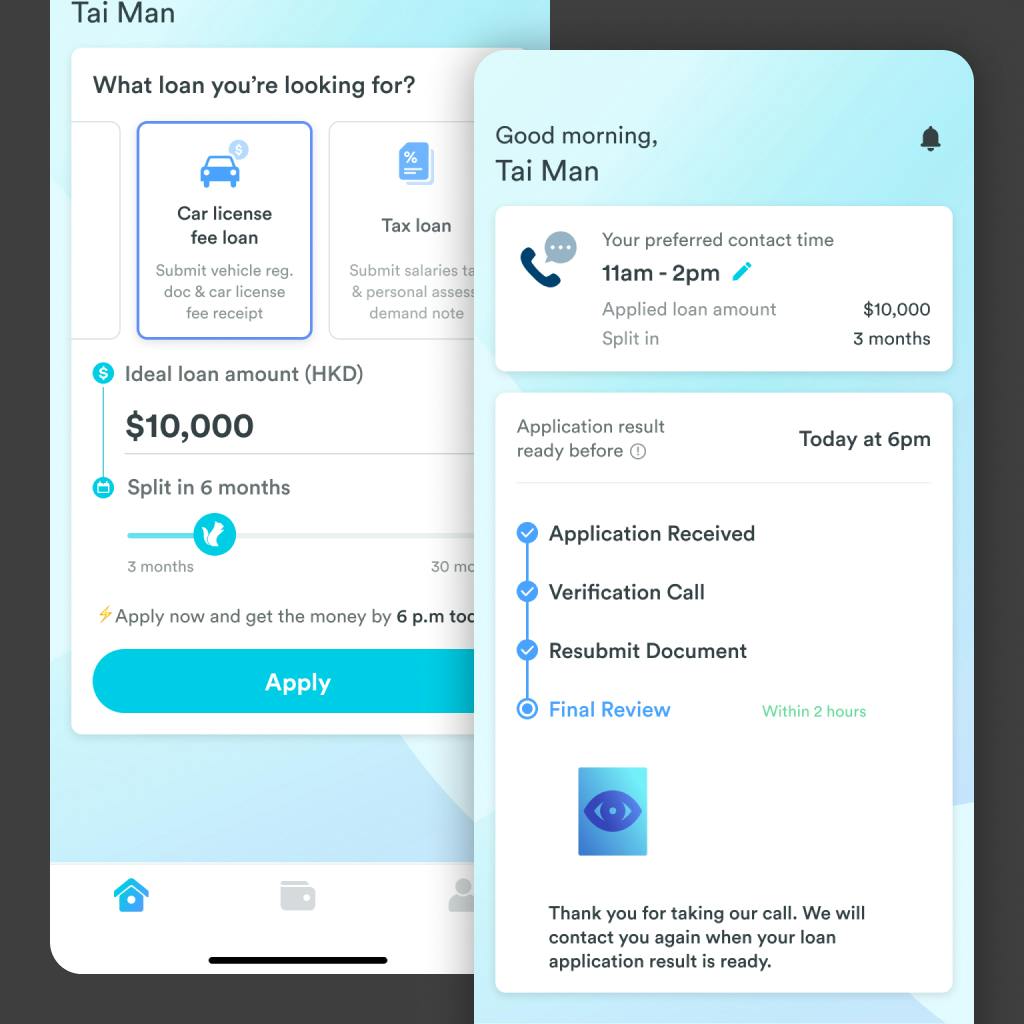
Grantit is a mobile application that provides a stress-free personal finance service. The application process requires no in-person interaction as everything is done within the app. Before the user applies for a loan in our app, they have lots of doubts in their head. We want to prioritize the determining factors, and increase the CTR as a result.

Impact

Gained 20% increase in CTR

New Interactive chart component generated a 20% increase in application rate. (compared to the average of last three months)
Team
Product manager
2 Software Engineer
UI Designer
Duration
8 weeks
My Role
User Research
UX / UI Design
Prototyping
Insights & Ideation
High-level customer journey
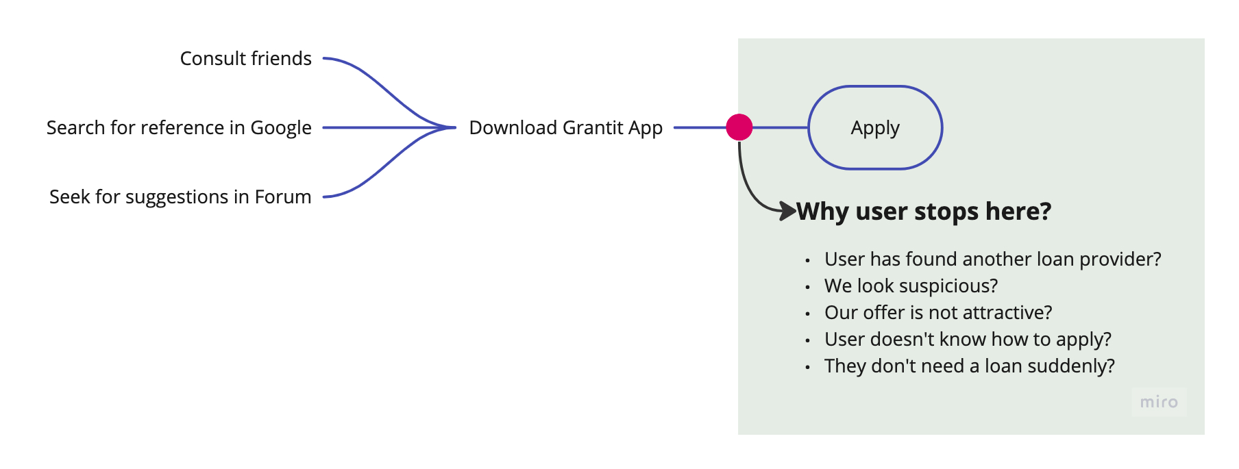
Since the Apply task has the highest drop-off rate, we need to find out the reason behind and provide solution
What stop users from applying?
Without pre-existing insights, we have no idea why users apply for loans in Grantit, or why they don't. This means that any number of reasons could be possible.
Discovery
Small details make a big difference
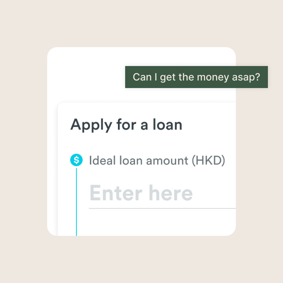
After interviewing with 6 of our current users, we gathered 3 critiria that they used to determine whether to apply for a loan.

1. Process time

Users need the money urgently, they will not apply if the process takes too long.

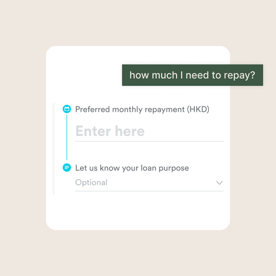
2. Approved loan amount

Users care about the interest rate. How much they need to repay in total once they receive the loan.

3. Reliability

Company reputation plays an important role, users need to ensure the company will not steal information, or charge unreasonable rates.

How might we demonstrate the value and benefits of linking their bank accounts to users, ensuring they feel it is worth the perceived risk?

I assumed that transparency was the key. From the contextual inquiry, we observed the following when users apply for loans:

1. User gather social proof of the Loan provider from online forum

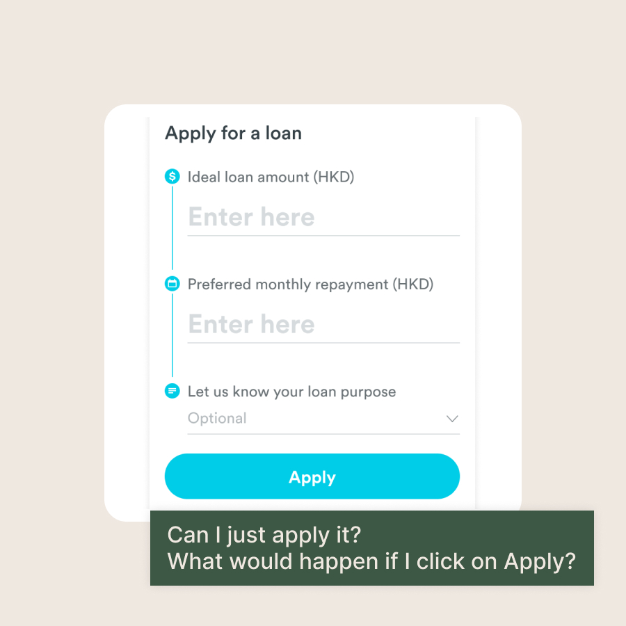
2. Ambiguity and uncentainty of loan details stop them from applying
From Ambiguity to Transparency
Provide result at the beginning
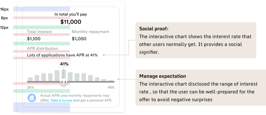
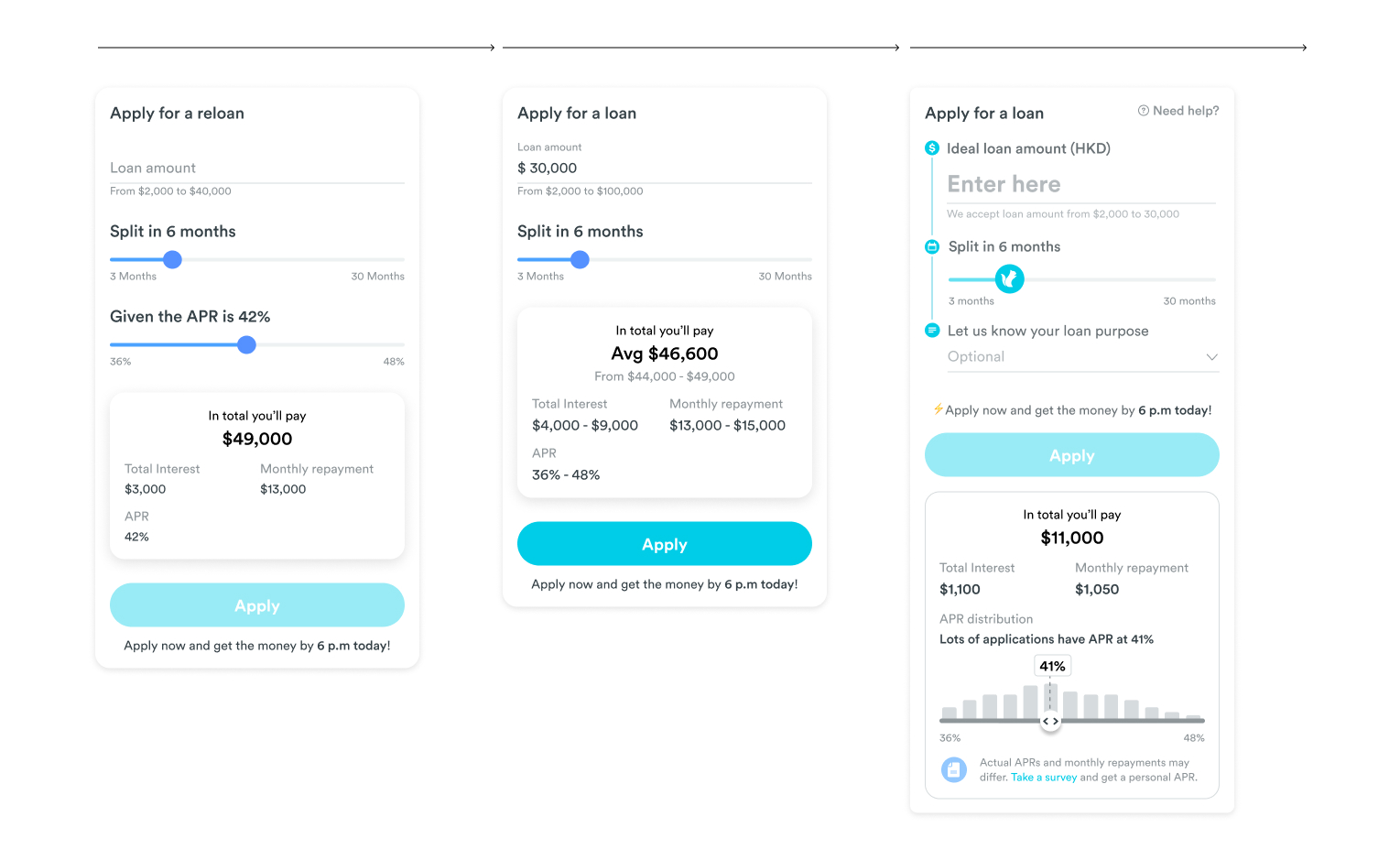
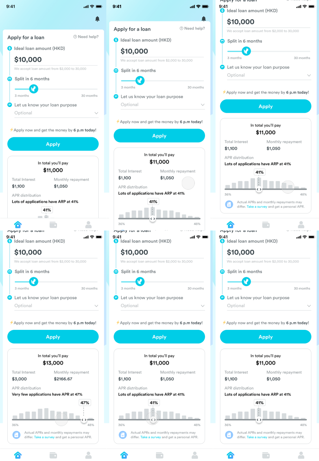
Most loan companies have an interest rate calculator, which can be useless because users cannot determine the interest rate until they receive an offer. To address this, I sought the possibility of gathering real statistics from our developers and disclosing the distribution to our users. Grantit now shows users how many people are receiving a specific interest rate and how rare it is to receive a high interest rate, helping them make informed decisions when applying for a loan.
Wrong hypothesis
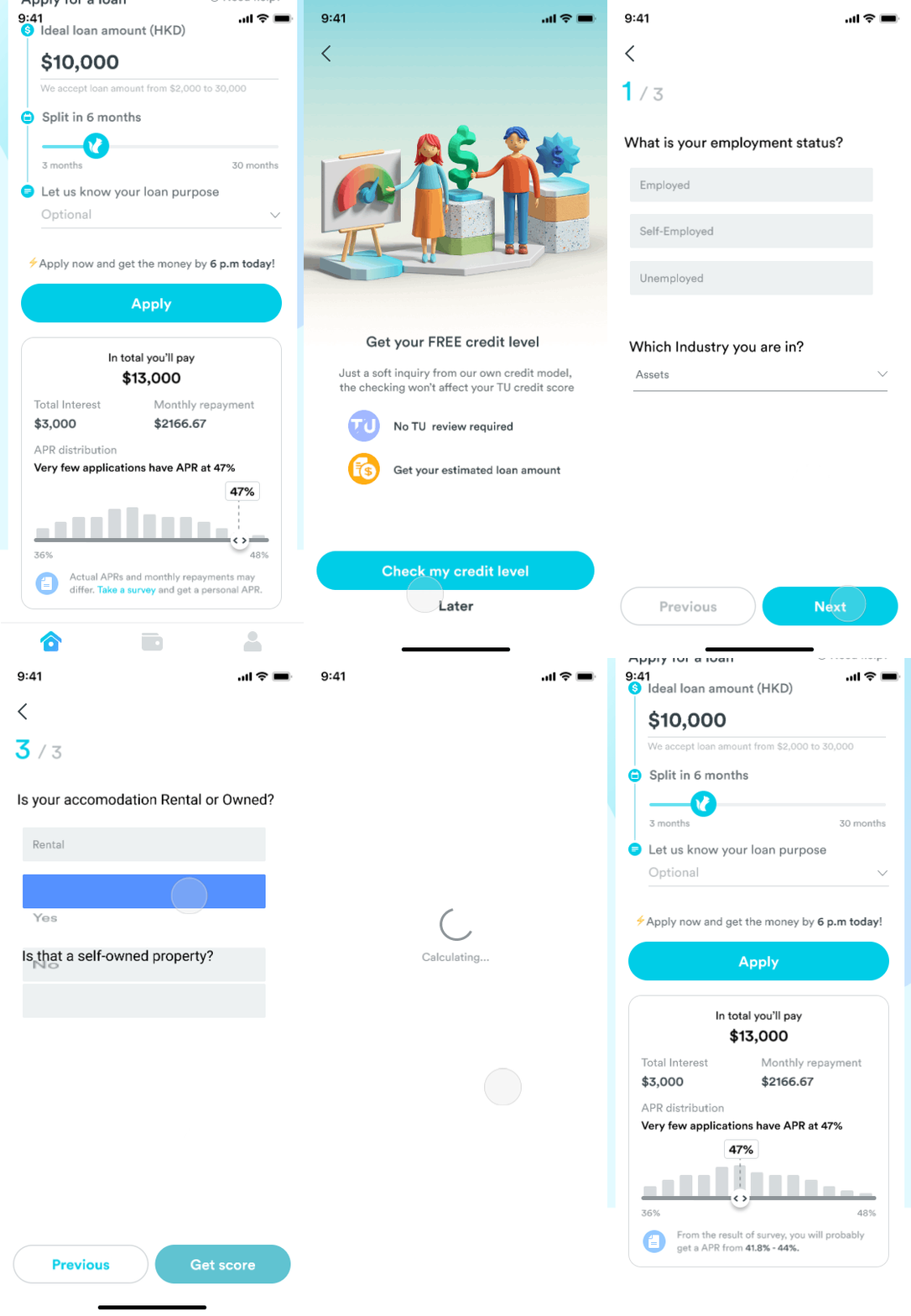
Although the new interest rate calculator provided useful information, it did not provide further details about the final loan offer. To address this, we designed the Credit Level Checker, which would ask users a few questions to provide a more precise prediction. However, the Credit Level Checker did not improve the application rate, and it was killed after rounds of poor testing.
Open statistics to build trust
The distribution chart also serves as social proof for users. To achieve the best results, I recommended showing the exact number of applicants in the chart. However, this information is considered sensitive, so we opted to use descriptive wording like 'Lots of applications...' instead.
Iterations
To save users the effort of typing and ensure that the interest rate range is limited properly, we opted to use a slider component instead of an input for setting the interest rate.
Process Disclosure - FAQ
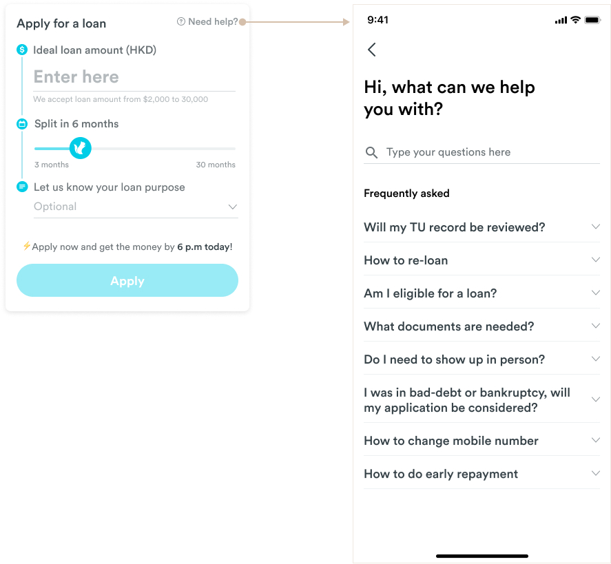
To assist users who are unclear about the loan application process and to save our admins' time answering basic questions like 'What documents are needed?' and 'Who is eligible to apply?', we added a FAQ page and placed the entry above the loan application.
The impact
Application rate increased by 20%
The new interest rate calculator and FAQ page have increased the application rate by 20% compared to the average of the last three months.
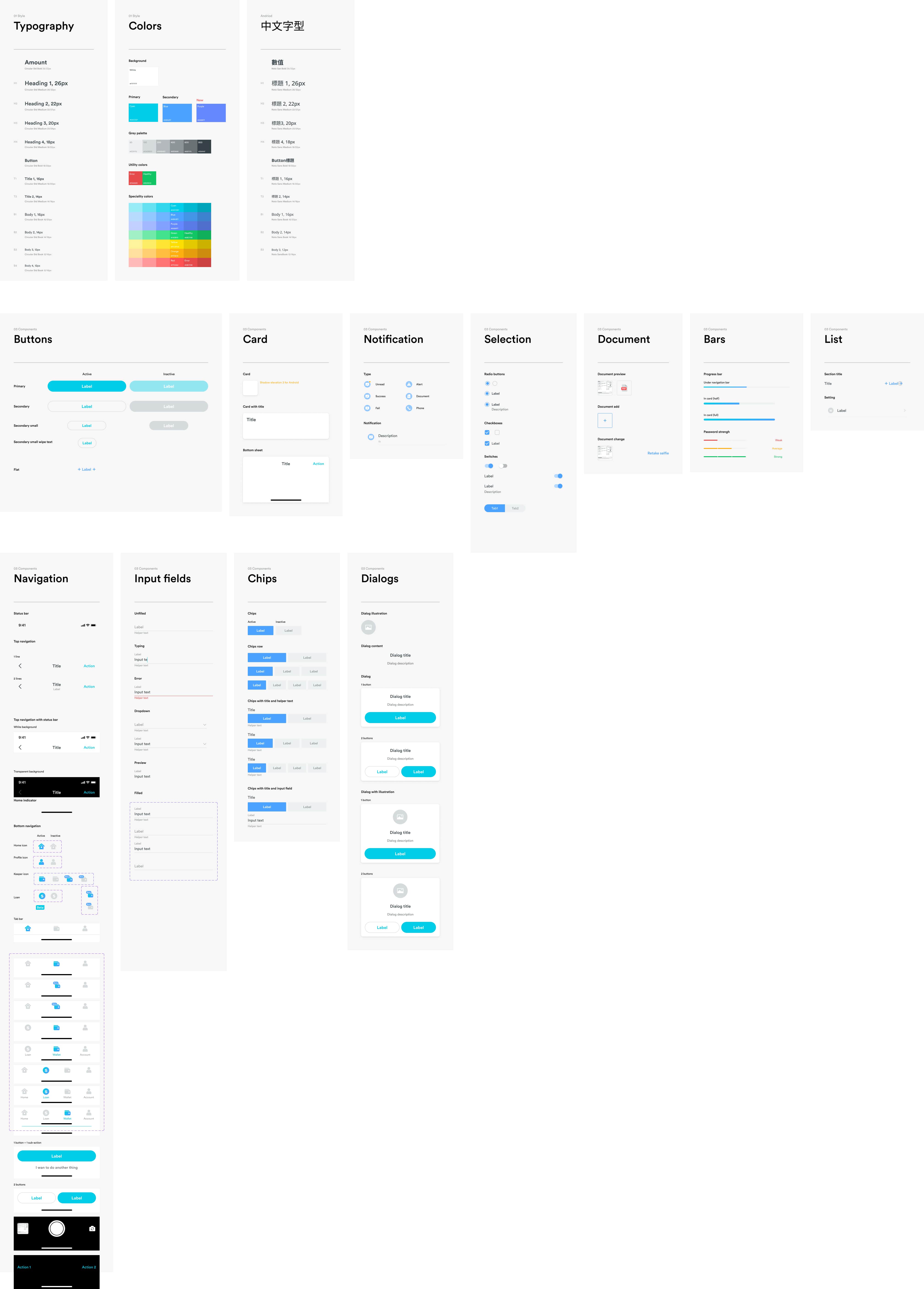
Design system
I assisted in maintaining the Design Guidelines and developed best practices for our Figma file system to separate ongoing features from ready-to-ship features. This helped us to organize our design assets and collaborate more effectively.