Keeper - Manage your credit cards in one place

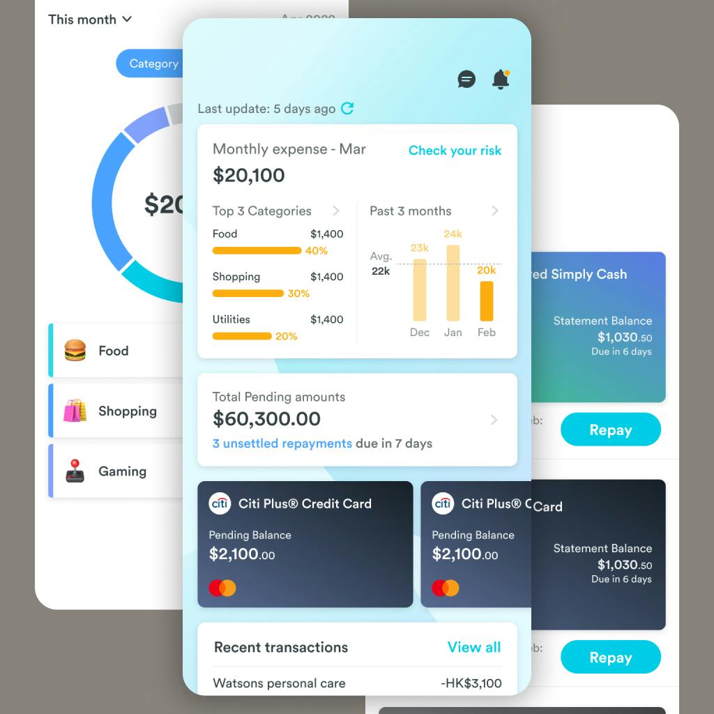
Our targeted user usually have 3-10 credit cards. It is a hassle for them to spend 30 minutes every month to keep track of the transactions and make repayment. Grantit provided a solution to minimize the time to 5 minutes. This helps users to build a successful financial management habit.

Impact

Growth - 100% increase in new user registration

Launched new feature that expands the product line to a wider group of users, resulting in 2x growth in new user registration.

Team
2 Product manager
3 Software Engineer
UI Designer
UX Designer
Duration
20 weeks
My Role
User Research
UX / UI Design Lead
Prototyping
Information Architecture
Insights & Ideation
Kick off
Single feature holds the product growth back
From a product perspective, Grantit currently only provides personal loans, which can be limiting for product growth as the user base is almost fixed. However, one Product Manager has proposed a new direction for an expense tracker. The entire product team agrees with this idea, but the user experience must be way better than the market competitors.
Early insights from the research
We conducted research with 8 participants who matched the critiria as our targer users. 90% of users tried to use an expense tracking app because they were either recommended to do so, or wanted to see where their money was spent. However, none of them continued to use the app for more than two months.
  • 90%
    of users used or they are using some kind of expense tracking app
    For those who gave up on the habit, all of the app that they have mentioned require them to log the daily transaction manually.
  • 100%
    of users gave up using the expense tracking app in 2 months
    I assumed that user want to track the expense, but not logging the transaction in and out.
  • 30 mins
    are spent monthly in balance checking, repayment, and going through the transactions in detail
    They think managing the cards is a hassle
  • 100%
    of users hate paying extra, like overdue fee or interest
    They will check the transaction record regularly to ensure no overdue
Insight
It became clear that users do want to achieve the goal of having a better financial situation, but the task of logging data is not something they expect to do autonomously. We agreed that logging transaction records manually is the pain point to our targer users. Instead, we combined our research insights with available technology and decided that allowing users to link their accounts within our app would be more consistent with their previous experience.
Focus on the core
Seeing the gathered context from the interviews revealed what truly mattered. I mapped out the user journey to help the team understand the context of use and the core features that should be included in the first version.
Challenge to overcome
Beyond the manual logging task
Although we had the idea to solve the mannual logging pain point, we observed that the real challenge to overcome are:

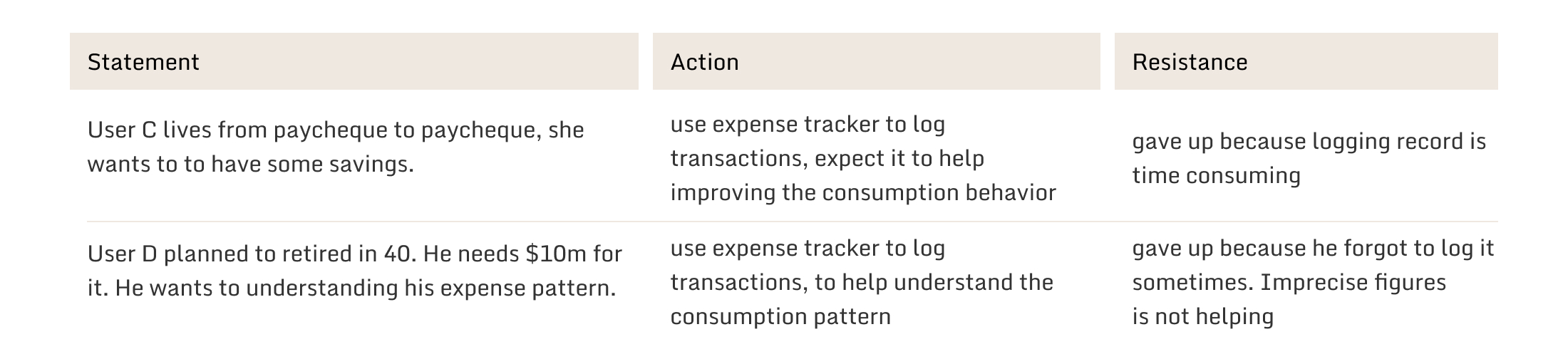
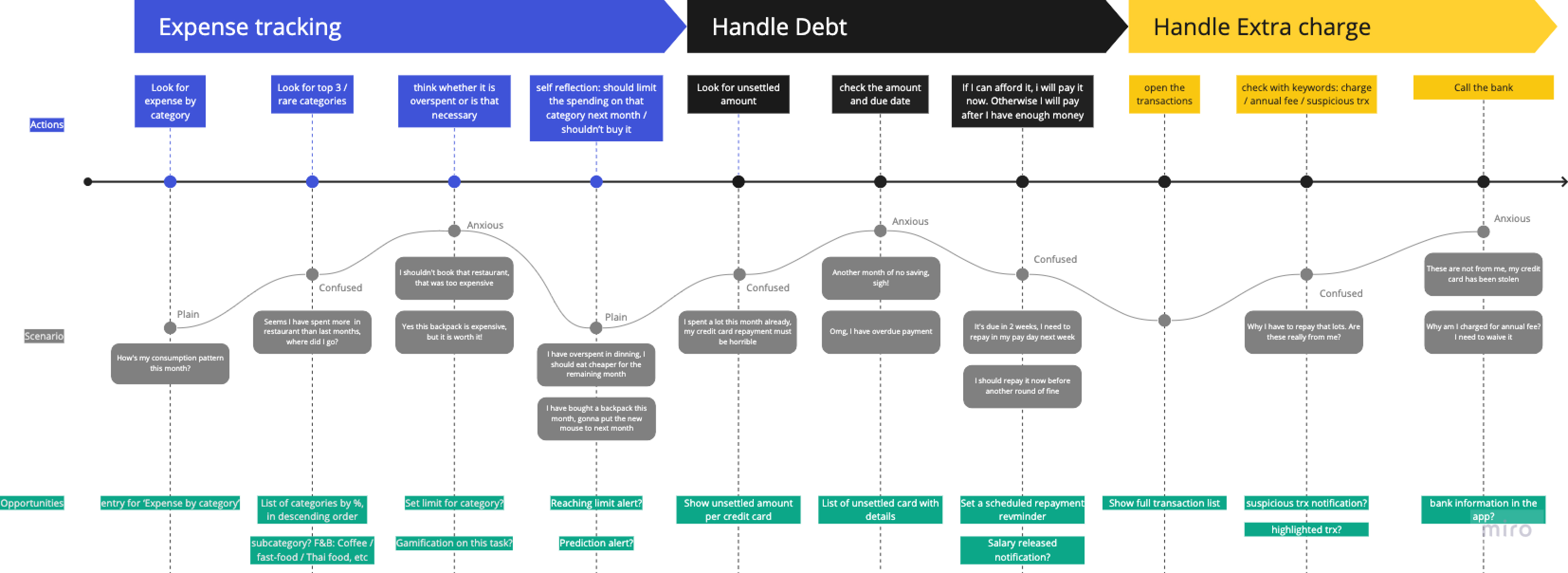
1. How to gain trust from users to link-up bank account

2. How might we help users utilize the credit card to save more

Gain Trust
Without linking-up the bank account, we cannot provide service to users. From the research, we break the trust issue into two parts: Security and Exit strategy.

Rich Security Statement

Security could be abstract, but we made it more tangible by providing a rich security statement. We can also provide a link to the security statement page to let users know more about the security measures we have taken.

Exit anytime

I designed the exit strategy to be simple and obvious. Users can delete their account and all the data we have collected will be deleted as well.
Deeper insight
Overlooked needs
When we were doing the interview, most of the users stated that the reason of applying credit card is promotions. However, the promotions are scattered and not well promoted by the banks, making it difficult for card owners to find them. We decided to add this feature as it matches the user context, allowing them to see a list of promotions related to the cards they own.
Define success
The user flow is split into two parts: Onboarding and Dashboard. The success metric defined for Onboarding is the bank link-up rate, while for Dashboard, it is session length.
Wireframe
With the help of another UI designer, I was able to focus on ideation and act as the communication bridge between Product Managers and the design team. By combining business requirements and insights from the research, we were able to provide valuable features in wireframes as deliverables.
Information hierarchy
There were many features in dashboard, we prioritized them and kept the important part above the fold. The hierarchy follows the context: Start from looking for spending statistics, then credit card repayments, and go through the recent transactions roughly at the end.
Feature Parity - Whatsapp Notification
After introducing the user journey map to the team, I was asked where we should put the WhatsApp notification entry. This was the first time I had heard of it. Handling ad-hoc tasks is a part of the daily routine in the product team. To help the team understand how to approach this request, I explained the context of use and app engagement. In the end, we reached a consensus to lower the priority of this feature.
Final Design
We split the whole feature into three sections: Onboarding, Expense Tracking, and Credit card promotions.
Conversion Tracking
We used Amplitude to track the performance.
What I've learned
I was thrilled to participate in this project because it was the first time I had led a full product design process from 0 to 1. Through this experience, I learned how to transform the context of use from research insights into usable features and the importance of forming a shared understanding within the team through the User Journey Map. During the COVID-19 pandemic, everyone was working remotely, which impacted communication time and quality. However, having a shared understanding enabled the Product Manager and Developers to move forward with user empathy. Although the impact has been significant in terms of new user registration, I believe that there is room for improvement in terms of bank link-up. Therefore, I plan to conduct more usability tests to explore different approaches and find the best way to encourage users to connect with us.