YY Tutorial
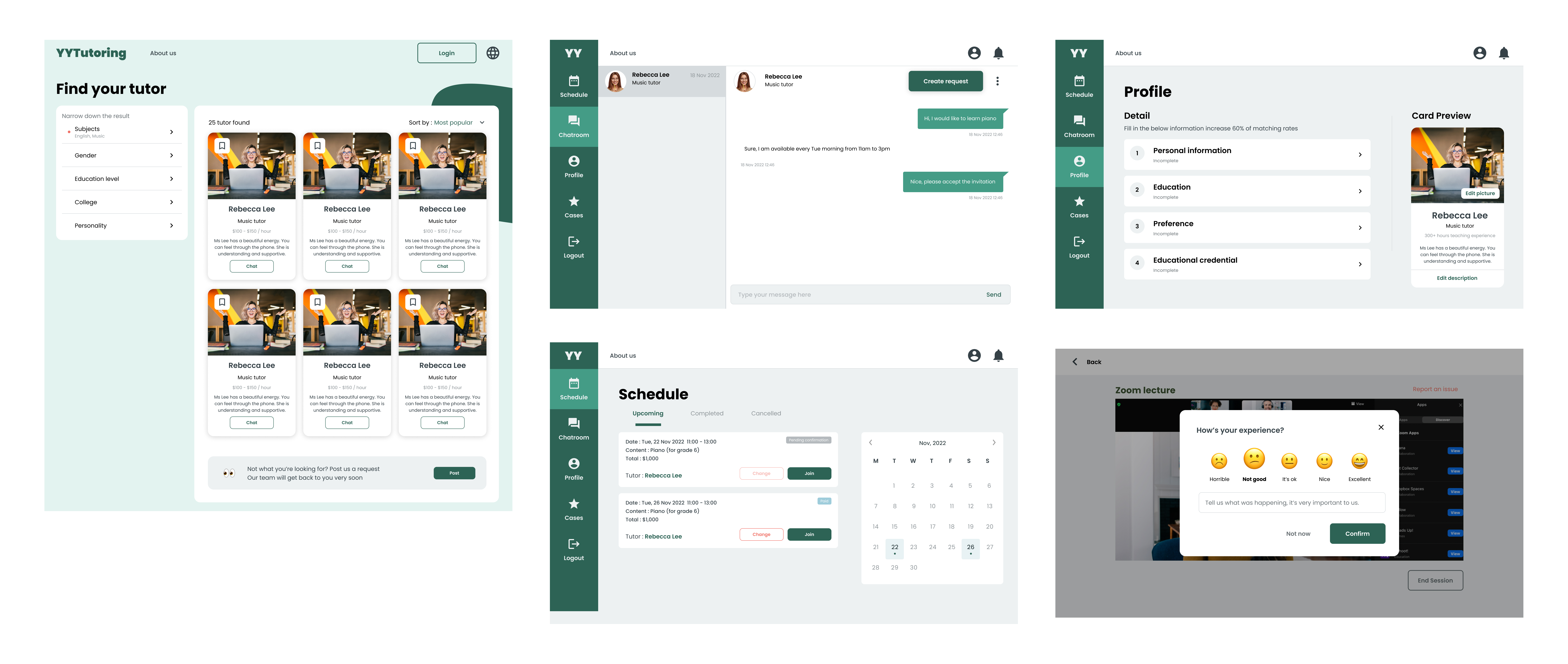
YY Tutorial is an web platform connecting students and tutors worldwide. This intuitive platform ensures personalized tutor-student matching based on subjects, expertise, learning styles, and availability. With robust communication tools, secure payment systems, and comprehensive user profiles.
The objective is to provide personalized learning experiences by seamlessly connecting students with qualified tutors who align with their individual needs and preferences online.
Lead the client
Users often have no idea what they need, and our client was no exception. We were tasked with delivering a student-tutor matching platform in three months, themed in green. Faced with a tight deadline and limited instructions, I needed to get the layout and experience right within the first month.
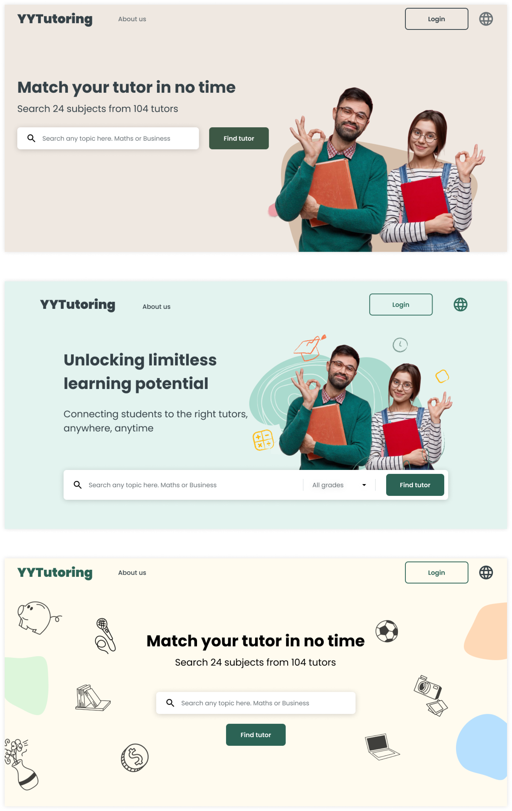
In a thrilling sprint to revamp earlier designs, I created three distinct versions, each bursting with unique colors, components, and visuals. In just two electrifying meetings, the client enthusiastically embraced the second design, thanks to effective collaboration.

Focusing on goals
While the client provided an idea of the information architecture, we emphasized that the platform should be designed with the user in mind to ensure optimal user experience.
To differentiate ourselves from competitors, we focused on the following goals:
Minimal friction: The registration process must be frictionless. Many current platforms aim to verify tutors by asking numerous qualification-related questions. Given that the platform is in its early stages, we need to make the registration process as easy as possible and leave the verification process to the admin.
Universal: Our client aims to target multiple countries, so we need to ensure the platform is universal. Cultural differences should be taken into consideration to make the platform accessible to everyone. Small details like date format, time format, and currency should be considered, and even sensitive information like gender should be made optional.
Keep the MVP in mind
Since the project has a tight deadline, and even the client is not confident about the product's survival, we are leveraging the MVP concept. This approach prioritizes rapid iteration and user feedback over meticulous consideration, leading to an initially flawed but progressively refined solution.

Design System
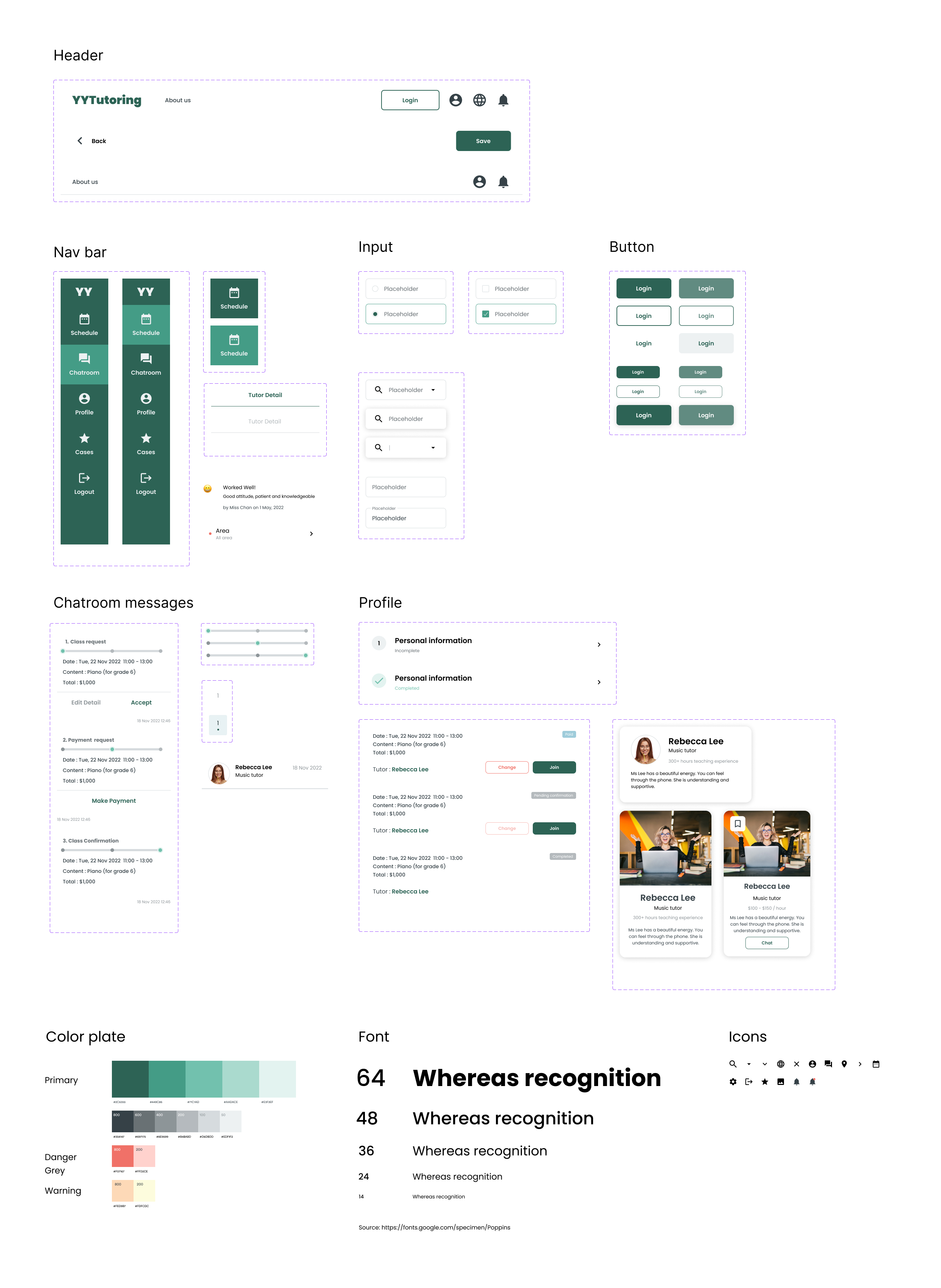
Although I am also the frontend developer, delivering the design to myself, utilizing a design system fosters consistency, collaboration, and efficiency through the use of reusable components.
